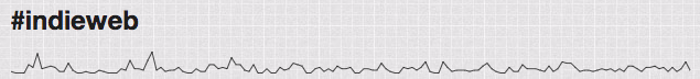
A while ago, inspired by @adactio, I had added sparklines to my home page and tag pages. After having them for a while, I realized that my tag pages would look better as sparkline bar charts instead of as a plain line.
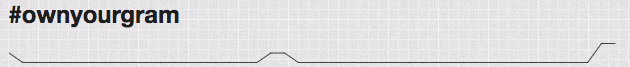
The lines looked fine for tags that had a lot of data, but didn't look good when there were only a few data points.
I made a few changes that affect the display of these.
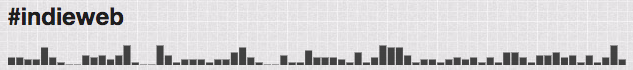
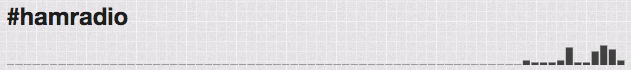
The main difference was switching to rendering the data as a bar chart. I also added zero-padding to the data when the amount of data in the chart is less than the number of segments I want to display. Without that, the bar segments would be potentially different widths for different tags. This also does a better job of representing the use of a new tag on my site like #hamradio.
I also realized that the SVG wasn't scaling on narrow screens, it was just cropping from the right. To fix this, I added a couple attributes to the main SVG tag, width="100%" and preserveAspectRatio="none". This allows the SVG to shrink its width while still maintaining the desired height!