Knocked out a couple of minor UI improvements to Quill this morning.
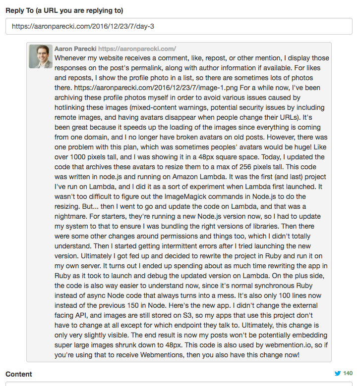
Previously, the reply context field would show the whole note, so super long notes or blog posts would take over the whole screen. (Issue 62)

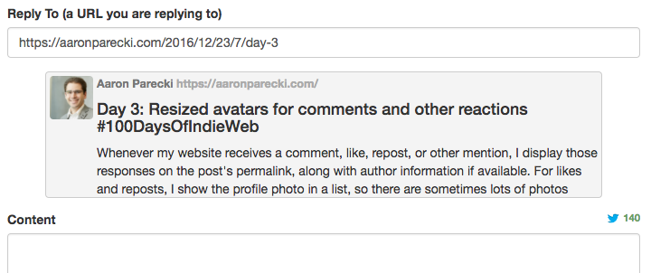
Now, it's smarter about noticing when the thing you're replying to has a name, and shows you the name and also truncates the post part way down.

Much better!
Also, when you're typing in the content area, the text box will now automatically expand if you get to the bottom. (Issue 61)
