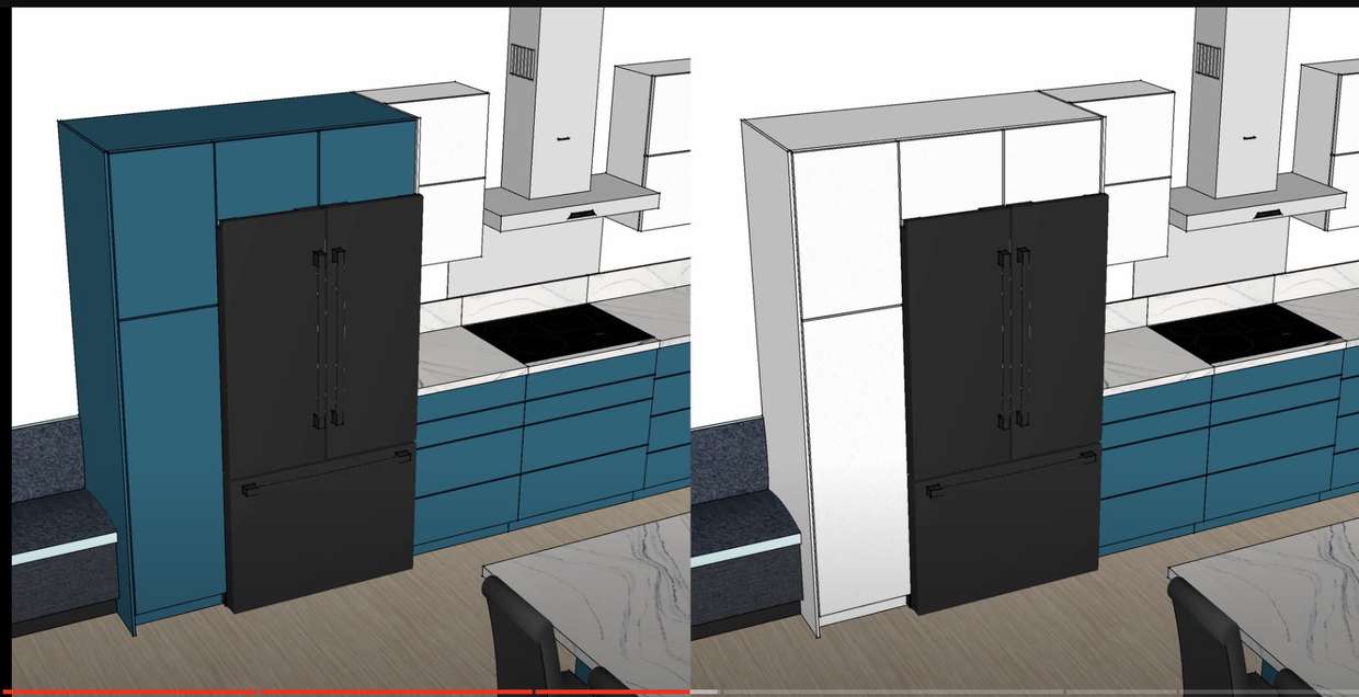
-
-
@aaronpk I think white looks more streamlined, though could see the blue working if you want something a little funkier. The blue draws attention and usually you want the fridge to visually disappear.
-
@aaronpk To my eye blue is the obvious winner.
-
@aaronpk How about white on top and blue for that lower cabinet? If that’s not an option, I vote for blue.
-
@aaronpk With the wider, whole room render of the ktichen, definitely white to match the upper cabinets. With this smaller cropped-in view of the Black Fridge, blue to match the base cabinets. I vote WhOLE Kitchen view and white to match the upper cabinets.
-
@aaronpk I would say it depends on the effect you want. Blue makes the tall cabinets part of a larger whole. White makes the tall cabinets stand apart and emphasizes the fridge.
-
@aaronpk white looks so much better
-
@aaronpk I am on team "make all the faces match" (below counter height blue, above white)
-
@aaronpk blue for sure
-

-
@aaronpk I vote blue
-
@aaronpk What does it look like with blue for the cabinets beside the fridge and white for the two above?
-
@aaronpk that white is nice. I really like the contrast with the black. The blue and black feels overall too dark.
-
@aaronpk I'm not seeing a Mastodon poll here, but, in any case, I like the blue.


Blue and white stripes!