I had a great time in the sessions at IndieWebCamp West yesterday! Today is project day, so I started the morning off listening to some chill tunes with other folks on the Zoom "hallway track" deciding what to work on.
My blog post permalinks have been bothering me for a while, I feel like they are too cluttered. I mostly like the design of my notes and photos permalinks, since the content on those pages is relatively short, I don't mind how much other stuff on the page there is since it's also good for discoverability of my other content. However on my blog posts, people often come to those from some external source, and they're really there just to read the blog post and then leave. So I wanted to clean it up a bit.
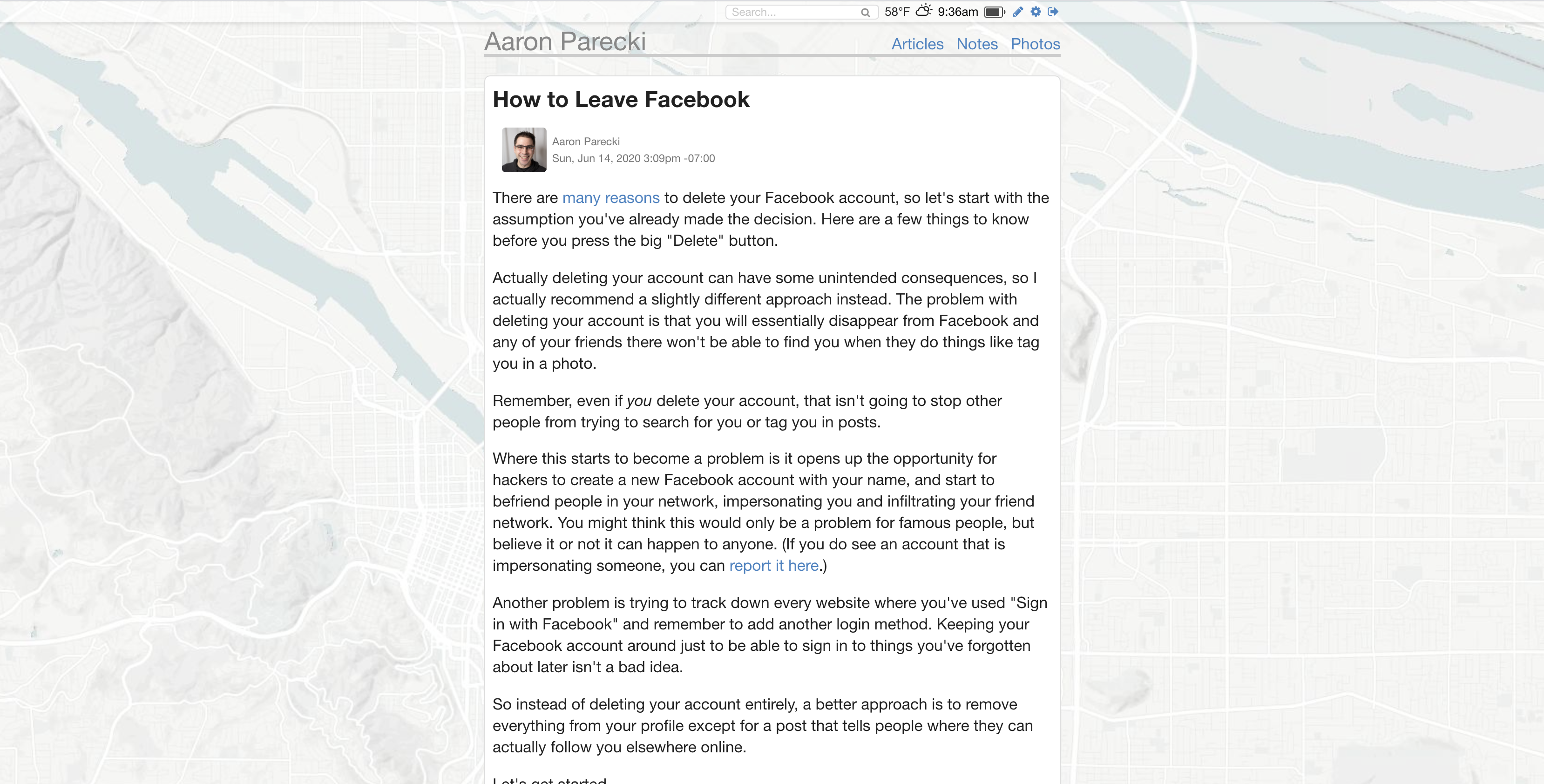
Here's what my blog post pages looked like before.

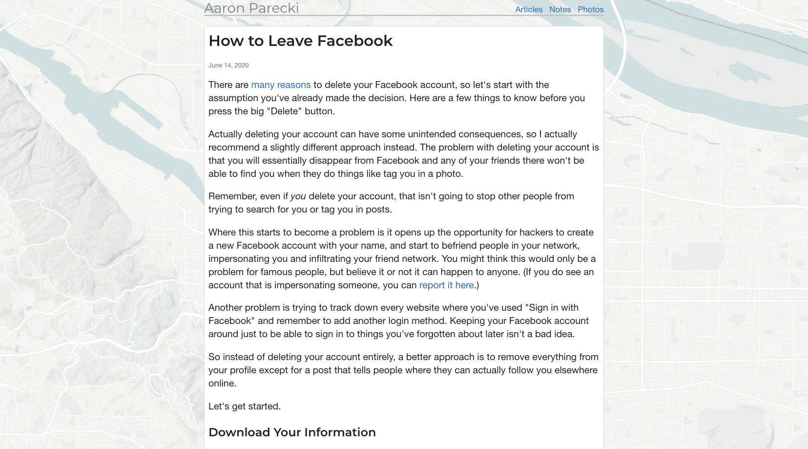
This is on a 13" Macbook screen with a browser as wide as possible. Here is what the blog posts look like now.

I wanted to give the blog posts a bit more space, so I increased the size of the middle column. I also took out the top bar with the clock and weather. I removed my little author avatar (it duplicated my name, and the photo wasn't really placed very well.) I also changed the timestamp to show just the date, instead of the full date and time and timezone. For notes and photos the time is possibly relevant, but it's really not important for blog posts.
I also added a custom font, which tbh I'm on the fence about using. I do feel like the slightly wider font goes well with the slightly larger column.
So that's the first of the projects for the day done!
Update: Thanks to a suggestion from Sebastian, I also increased the font size on the blog posts to keep a similar number of characters per line.

@aaronpk
Hm,
I would go for a larger font size then.
Before your posts had about 80 characters per line which is still fine but 110 feels too wide for me …
https://baymard.com/blog/line-length-readability