Inspired by cleverdevil's monthly summary pages, I started working on my own version of them on my website!
My month permalinks have shown a calendar grid of all the posts I made during that month for a while, but it's not particularly easy to skim that and actually understand anything from it.
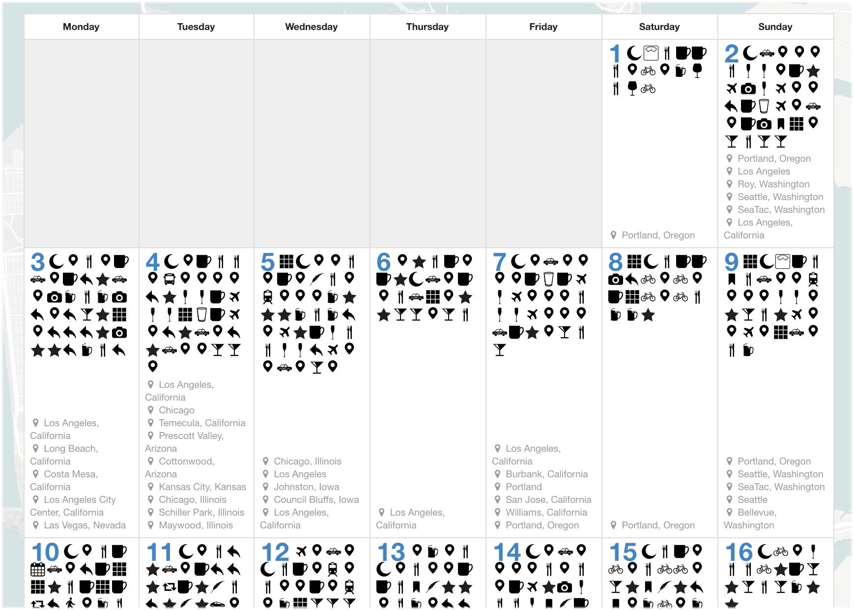
I had recently added a summary of my modes of transport for the month, which is a fun way to see how much I bike in a month compared to how much I'm in airplanes.

Today I added a few new sections below the calendar.
First is a list of all the photos I've posted that month. They are displayed in the same style as my photo albums, which are full-width justified, uniform height. It's a neat trick I learned from Flickr, and provides a nice looking photo grid of uniform height without cropping any images.

The next section shows a map view of all my checkins for that month. I didn't want to show a pin for every checkin, since that would be too many pins on the map clustered too close together. So instead I started by grouping by city name. That works pretty well when I travel to a few different cities in the month.
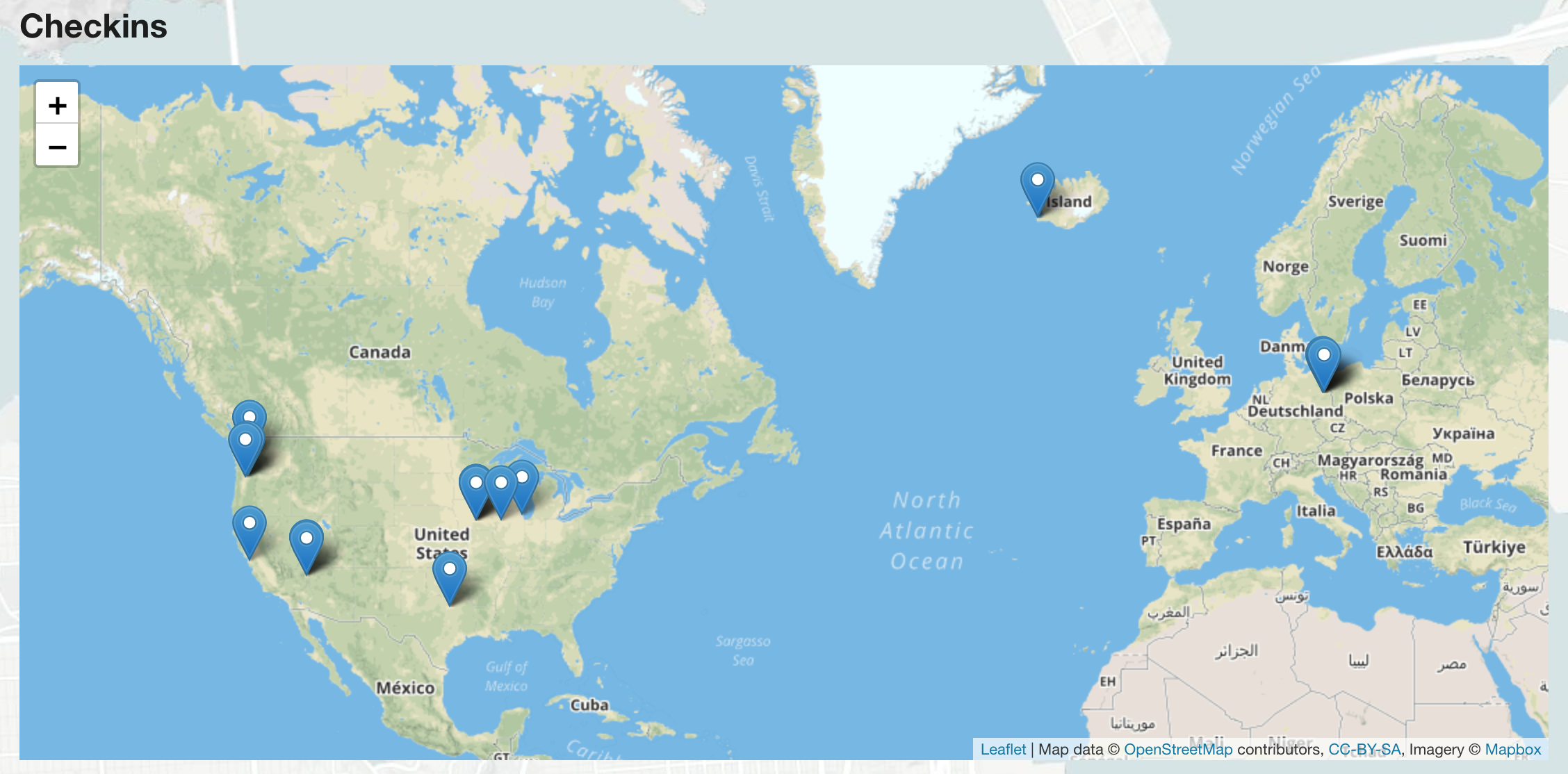
The problem with that approach is if I don't leave Portland for a whole month (it rarely happens these days but still), then the map looks like I didn't even leave a single spot. So instead, I actually group by latitude and longitude rounded to the nearest 0.1 decimal.
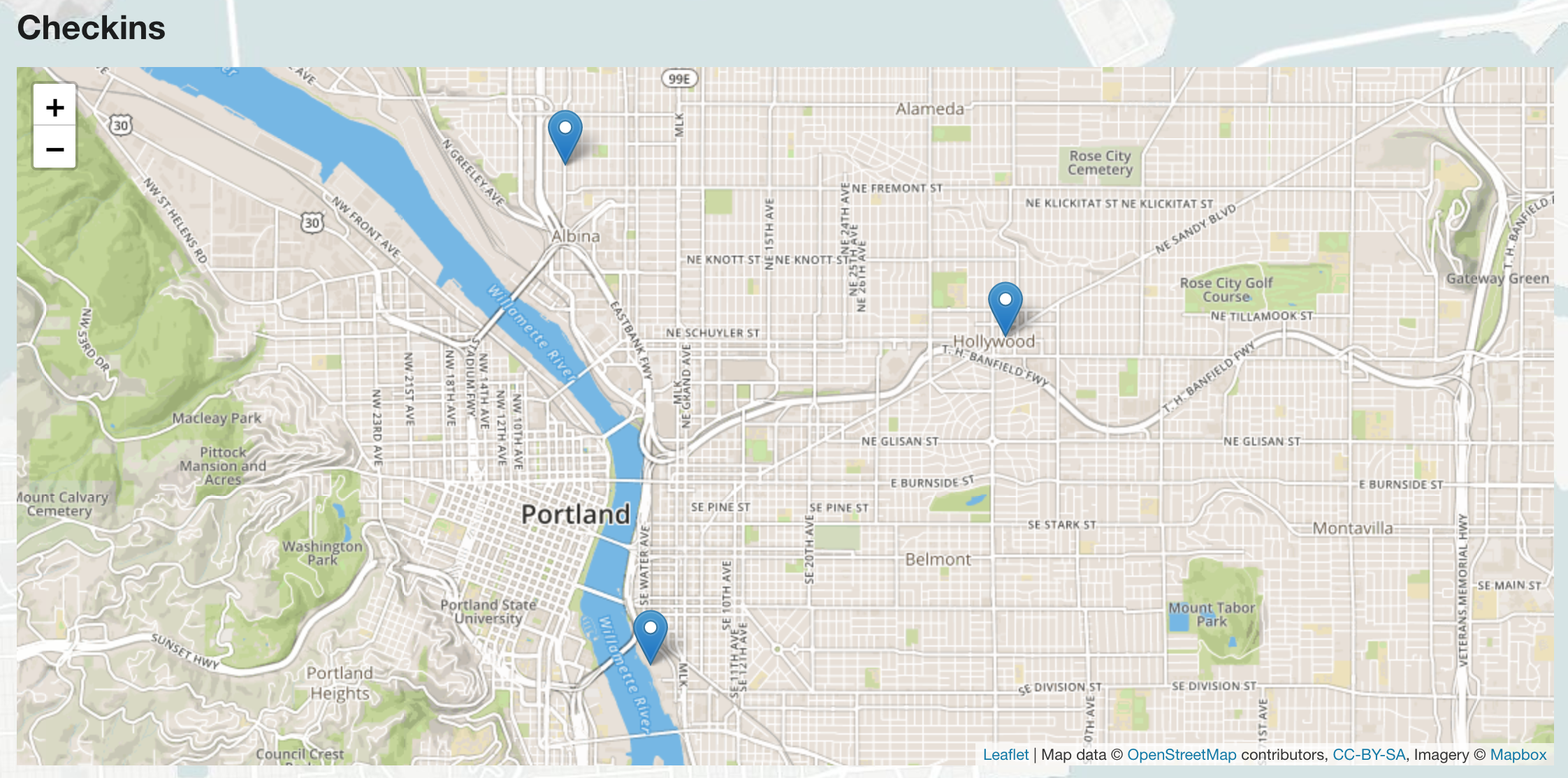
That way when I don't leave Portland, at least it shows a few map pins around the city.
I should probably switch this to use an actual map pin clustering algorithm, but this was easy and is good enough.
Below that is a section that shows a list of my "popular posts". I decided to rank my posts based on the number of interactions they've received. Replies are weighted the highest, followed by reposts then likes. So if something gets 10 replies, it will beat out a post with only 1 repost. I chose these weightings pretty arbitrarily, spot-checking a few months of data at a time. We'll see how I feel about it after some time.
So I'm pretty excited to launch this! Thankfully I already had enough things indexed in my database that it didn't require a lot of backend changes, it was mostly just UI and design work. We'll see how this feels for a few months and maybe there will be more things I want to add to it later, but this feels like a good start!
Thanks to cleverdevil for the inspiration!
