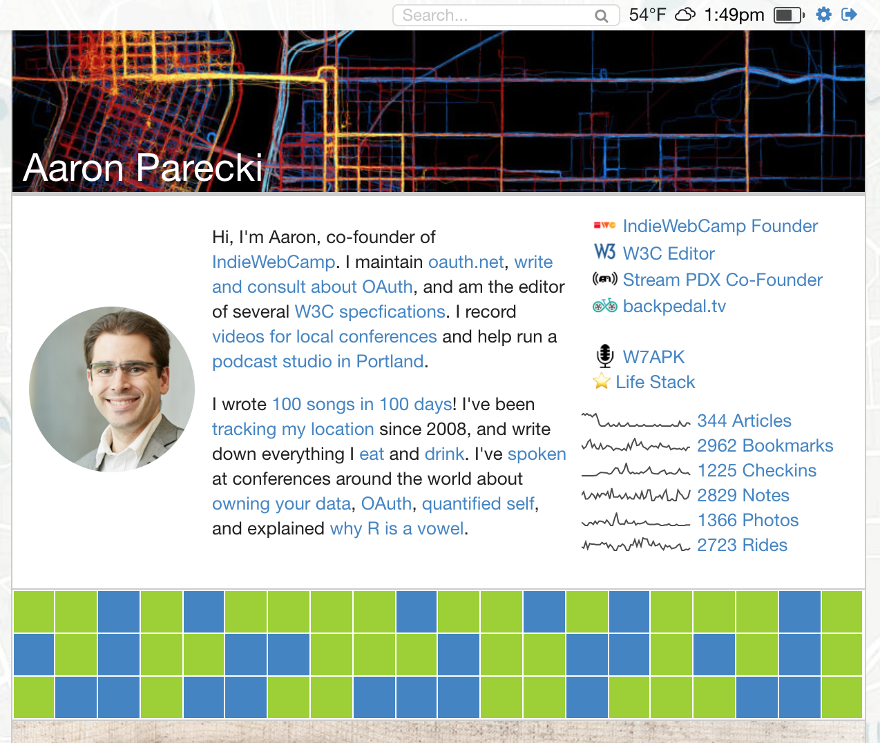
I just finished my IndieWebCamp hack day project, and I'm pretty excited about it!
A long time ago, my website used to have this 7x7 grid of pixels on the home page, which visitors could toggle between blue and green. It saved the state after you'd click them, so you could leave little pictures for the rest of my website visitors.

I eventually abandoned that version of my site, and that feature disappeared as well. I decided that it would be fun to add it back to my current website today!
So now, my home page has a similar section at the top with a little grid of pixels again!

There were a few differences in my approach this time around. I decided to make the grid 20 pixels wide by 3 pixels tall, in order to reduce the chances of people being able to spell things or draw anything inappropriate.
I wanted the grid to be responsive as well, so that the cells shrink appropriately when the width of the column shrinks. I found this nice answer on StackOverflow, "Grid of Responsive Squares", which pointed me at a technique I hadn't know about, which is to use a percentage for the padding-bottom property. Each cell in my grid is calc(5% - 1px) wide, with padding-bottom: calc(5% - 1px) as well. This makes the height match the width, which is based on the relative size of the container.
I also made the grid realtime! If you open the home page in two browsers, you'll see one browser update when you click a pixel in the other! I was able to do this without any complicated server-side support thanks to the nginx push-stream module that I already have installed. It lets a browser subscribe to an endpoint using the EventSource API, and then from my server I can send a POST request to the nginx module to broadcast data to anyone listening.
Maybe my next project will be to get some Neopixels and make a little thing for my desk that always shows the current pattern!
