I've been wanting to improve the layout of my blog post archive pages for some time. Previously, the page just listed out the full contents of the last 20 posts, and you could continue navigating back 20 posts at a time. I realize that some people like reading the full posts on the archive page, rather than having to click into each one, but it wasn't easy to just skim the post titles to get a sense of what was on the page.
As an intermediate step before launching a real archives view, I took Tantek's suggestion of adding a sort of "table of contents" view to my existing pages.
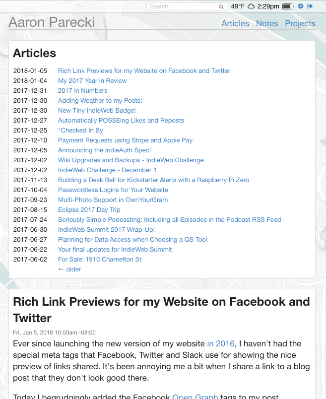
Now on my "articles" page, there is a list at the top of the names of each post.

Below that, I still show the full contents of each post. The table of contents also links to fragment IDs for each post on the page, so that you can quickly read the posts without doing full page loads.
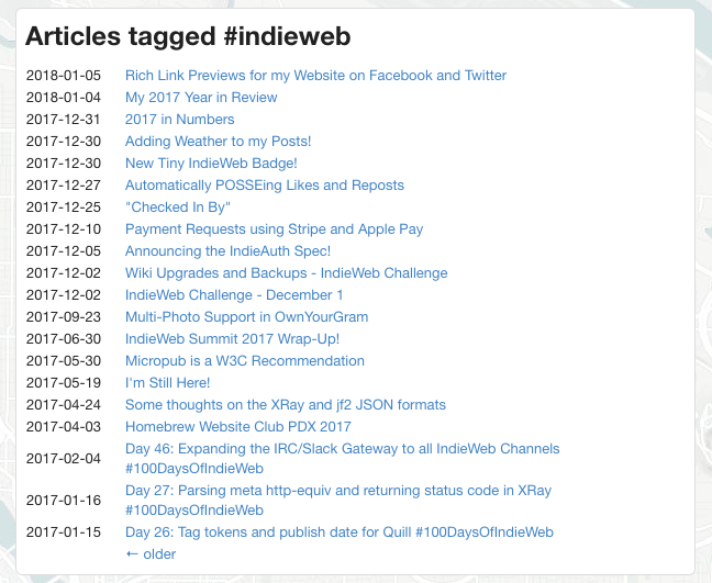
As a bonus, this also works with my tag-filtered article pages, such as Articles Tagged #indieweb.

I like this view since it makes it a little easier to find a lot of past content by topic rather than having to continue to page back 20 posts at a time.
I'm still planning on improving the overall archive browsing on my site, but this was a relatively easy first step and is a good improvement.
