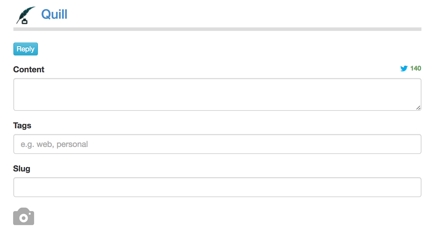
I realized that most of the time I'm not posting photos in Quill, so having the photo fields in the note interface so prominent isn't necessary, and adds clutter. So now, a camera icon takes the place of the form fields, and when you click it, it expands to the fields that were there before. This makes the note interface slightly cleaner.