The other day I read a pretty funny blog post called "10 things I learned making the fastest site in the world". It's a little tongue in cheek, but overall has some good tips. One that caught my attention was the section on using web fonts.
#10 Computers have nice fonts
I’m always torn when it comes to web fonts. They’re a pain, performance-wise. But it’s nice to have nice things.
I gave it a bit of a think-over for this site and came to a stunning realisation in four parts:
- macOS has nice fonts
- Android has nice fonts
- Windows has nice fonts
- iOS has nice fonts
...
If you tell yourself you need the same, custom font on all devices then things have already gone too far and there is no hope for you.
This is followed by a snippet of CSS called "good-enough.css".
body {
    color: #212121;
    font-family: "Helvetica Neue", "Calibri Light", Roboto, sans-serif;
    -webkit-font-smoothing: antialiased;
    -moz-osx-font-smoothing: grayscale;
    letter-spacing: 0.02em;
}
This CSS includes fonts that are available on all the platforms listed, as well as tweaks the font smoothing used in WebKit and OSX.
This has quickly become my favorite default font to use in projects rather than just "sans-serif" or loading a Google Web Font.
I launched this change on my website, so you're likely reading this post in my new font style. Below I've included some screenshots showing the differences between the old and new fonts.
Old Font
This is the default font that ships with the Semantic-UI CSS framework which I use on my site.

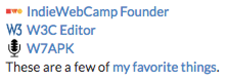
The font is called Lato, and it's one of the fonts available via Google Web Fonts, which means you have probably seen "loading fonts.googleapis.com" in the status bar when on my website at some point in the past. It's a nice font, but do I really need this text to look exactly like this? Probably not.
Switching to System Fonts
Here's what it looks like when I apply just the font-family CSS rule so that Helvetica Neue is rendered on OSX.
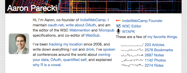
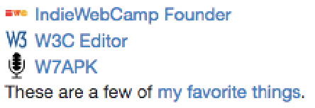
I think it's perfectly acceptable.
The Finished Product
Adding in the tweaks to font-smoothing, you'll notice a subtle difference in the rendering. Suddenly the text looks a lot crisper!
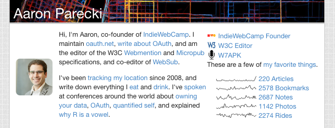
I'm happy with the look of this font, and also happy that I no longer need to rely on the Google Web Fonts service and make people load that extra HTTP request when viewing my site!
