At IndieWebCamp Nürnberg, I didn't end up spending time on my home page design, despite a great day 1 discussion on the topic. Instead, I made a few fixes to my site, and built a quick indie reader in IRC, which shows me posts from people I'm following, and lets me reply to them from IRC as well.
It's ugly, but it works!

When I type !reply in IRC, my bot makes a Micropub request to my server which creates the post.
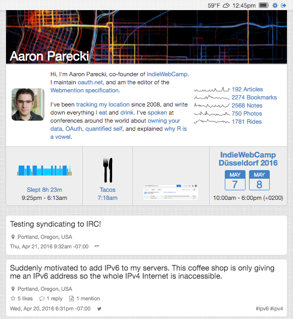
After I got home, I was inspired to spruce up my home page design since there were quite a few great ideas from people. Jeremy Keith added sparklines to his home page, showing activity in a few different kinds of posts. I liked that idea, and wanted to do the same. I also moved my bio to the top of my home page, since that's more of the primary content of the page. Now my posts appear below the header block.
I also added four mini previews of posts, showing the last night's sleep, the last thing I ate, the last photo I posted, and the next event. I think this does a good job of showing a little more about me than just my bio and just the last few notes I've posted.
Now my home page looks like this! I think it's a great improvement over what it was before, when it just started with the latest post.

Overall, IndieWebCamp Nürnberg was a huge success and I had a great time! I'm looking forward to going back in a couple weeks for Düsseldorf! Thanks to everyone who made the event possible!
