Indie WYSIWYG: How I Fixed My Instagram Problem
I talk about what-you-see-is-what-you-get posting system for my #indieweb site and how it improved my post quality.
About two years ago I built a better content management system for posting images. To do this, I added a bulk uploader and an album generation system. The whole point of this was that I was trying to get away from using 3rd party image posting systems.
I wanted something which would:
- let me keep original high-quality photos stashed in a safe, organized place.
- Enable me to place images and text in an organized fashion.
- Be simple enough that I would actually use it.
The Tension: Creating Content and Communication
Two years after making my album system, how did it work out?
Not so well. I don't really have more articles and albums. My blogroll from the last year looks like a glorified instagram page. I still let my photos rot on devices for a long period of time before posting them. In the past two years, I found myself posting a lot more directly through the twitter app---no PESOs---and letting images filter to my site using own your gram for most of my posts.
Part of this is just the nature of what I want to keep, and what I view as disposable when I'm creating content. That twitter thread that I commented on absent-mindedly isn't really something I'm interested in keeping.
Reflecting on the disposability of twitter posts a bit more deeply, there's probably a bunch of threads which I've posted which I do want to keep. Most common are conference threads which summarize events I'm at, or takes on other people's ideas. However, because these threads are mostly made for the consumption of other people and to start discussions, rather than storing thoughts for me to later reflect on, I've ended up prioritizing other people's ability to interact with the content, rather than my ability to maintain it.
It's easier for the average person to read through a twitter thread and respond to it, even if the quality of user experience on a thread of 15 tweets is substantially poorer than a single well formatted blog post. The fact is, if I were to syndicate articles to twitter, the number of people who engage with them would be way more limited than if I were to quote retweet with a thread commenting. It'd be less social and there would be fewer exchanges of ideas. Losing these articles to twitter's poorly formatted abyss feels frustrating, but I don't see a way around it right now. I guess all I can do is hope that with the twitter's poor responses to harassment, selective verification, and criticism regarding feature development lead people to jump ship towards federated systems which are more indie-friendly.
The Elephant In The Room: I'm Lazy.
So I'm not posting albums as frequently as I would like. I'm not actually using the interface I built effectively. Why?
There's a saying in the indieweb community: manual until it hurts. Don't automate what you're doing until it's so painful that you're compelled to automate. It'll take time to maintain the code that's replacing your manual--software rots.
This is a very subjective principle. What hurts one person is painless to someone else. The problem with this ideology for me: I'm lazy. If it's not easy, it's agony.
Even though my posting interface was effective, using it was the user experience equivalent of fumbling through a dark room looking for a light swich.
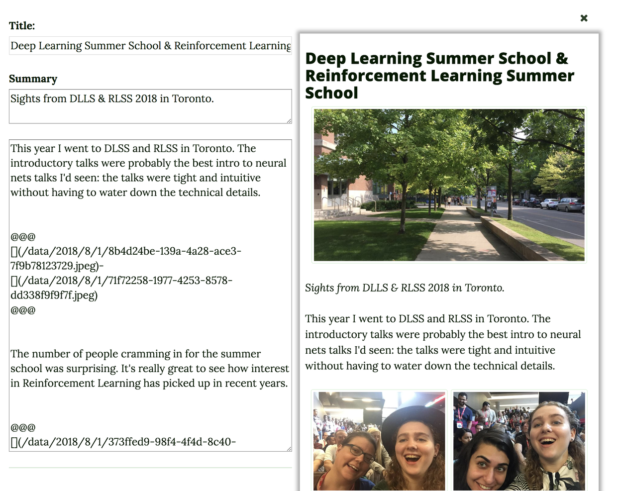
This is what my posting interface used to look like.
One of the greatest challenges for me when I was producing albums and articles was the type-setting. While it became simple for me to place and organize images efficiently, the text alone was not enough to properly visualize what the outcome would be.
Is img_2325.jpg really the image you think it is? Are all the images bundled in your ablum oriented the way you want them to be?
Often I would post collections of images, be exceptionally proud of it, only to find out that some of the phtotos were placed incorrectly. I would go through iterative cycles of moving photos around, finding that one of them was still out of place, and then moving them again. This was all just too much effort.
This hurts.
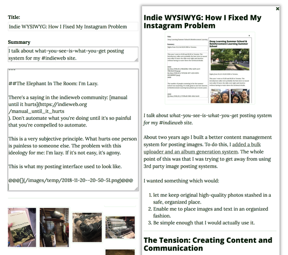
So I made a what-you-see-is-what-you-get image posting interface. I split the input down the left and the output on the right. I added some javascript functions which check to see if any of the form fields have changed, sends the markdown to an endpoint on my site which converts it to HTML, and updates the display.
Now I can see what I'm working on in real-time.
So what about these photos I have sitting around on my computer? They were unorganized, and going to waste. It's difficult sharing and enjoying a folder full of photos; no one wants to go through a folder full of photos. Since adding WYSIWYG, I've made more albums documenting my crafts, and I've actually gone and started adding old albums from years gone by.
The Unsung Hero: Historical Posting
The new interface was great, but it doesn't address one point: I'm not usually adding posts the day I take the photos. When I'm out and about I'm taking photos; I'm not posting them until I've edited them---something which I don't usually get around to until days later.
With articles, I don't really care what the date associated with the post is: the text is usually date-less and location-less. The association of date and time is secondary to the actual post. With albums, that isn't the case. The photos are almost always taken with respect to a location.
I didn't have a way to change the associated date. Whatever time and day the post was made was the time and day associated with the post itself. This became a mental hurdle I had to jump over each time I wanted to make an album: I either had to rush the album out the door day-of, or make my piece with it being forever associated with a completely wrong time (I was never going to go in and edit it in my cms files by hand).
Maybe WYSWIG wasn't the biggest UX issue after all.
Wrapping it up
Adding a new feature is all well and good, but whether the feature's use stands the test of time is the only way to evaluate its quality. Often I find myself adding new functionality, only to remove it in a few months after sparse use. It's been roughly six months since I finished making my WYSIWG interface. I recently went adventuring during a conference in virginia and ended up making a number of posts chronicling the visit. It's been close to half a year since I made my Indie WYSIWG, and the improvement has been consistent and lasting.
Success 🎉
What's the next step? Videos.


